Below is the list of widgets, in alphabetical order, currently on the platform:
AVE - (Add Value Equivalency) is used to estimate the amount of revenue attributed to an article.
The user can define the number that each document is multiplied by to give. That multiplier derives the AVE value. The best way to use this widget is using a consistent multiplier over time and comparing time periods.
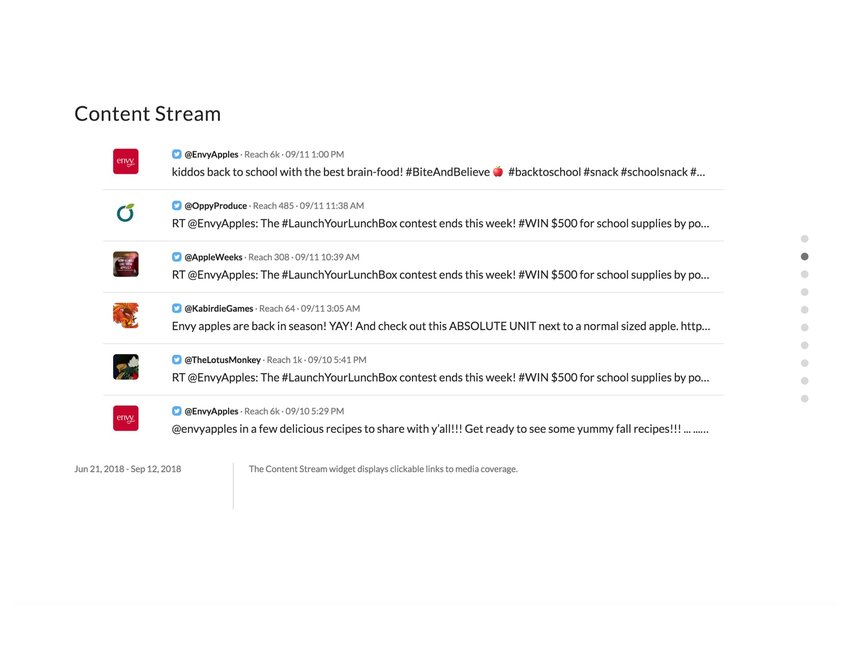
Content Stream - It's most applicable to monitoring incoming content. It defaults to showing incoming content by most recent appearing at the top.
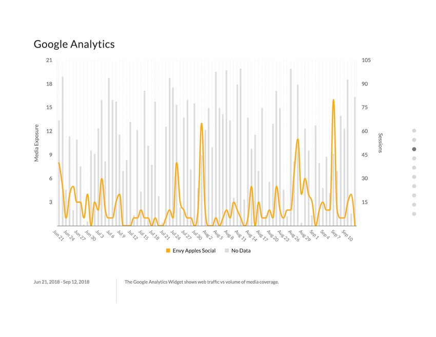
Google Analytics - Widget helps you understand Web traffic brought to your website. By linking our content with your website traffic, we provide a clearer picture of what types of articles brought users to your site. Supported for News and Social Media content.
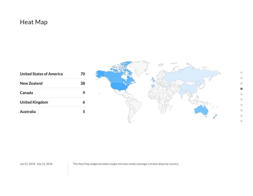
Heat Map - A way to measure the prevalence of content on a global level. Differing from Top Locations, this shows all locations and the presence of your relevant content there. For some countries, we offer the ability to drill down to a subregion level, prioritized based on the amount of subregion data we have.
Image - Input an image, via a URL, of something relevant to your dashboard. Typically used for
branding by inputting the company,s logo.
Pro Tip This widget works best with a square image (e.g.,
25 x 25 pixels).
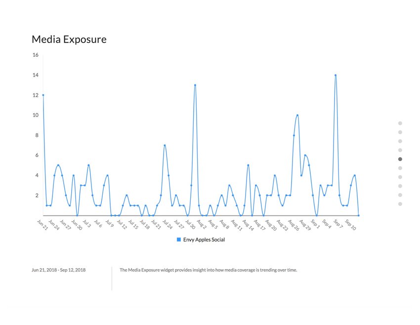
Media Exposure - The most widely used widget in our application. It displays the volume of content in a particular time period for your search.
Potential Reach - This number gives the potential number of eyes that have the possibility of seeing the piece of content. Each source has a reach number associated with it and each piece of content inherits the reach number associated with that source.
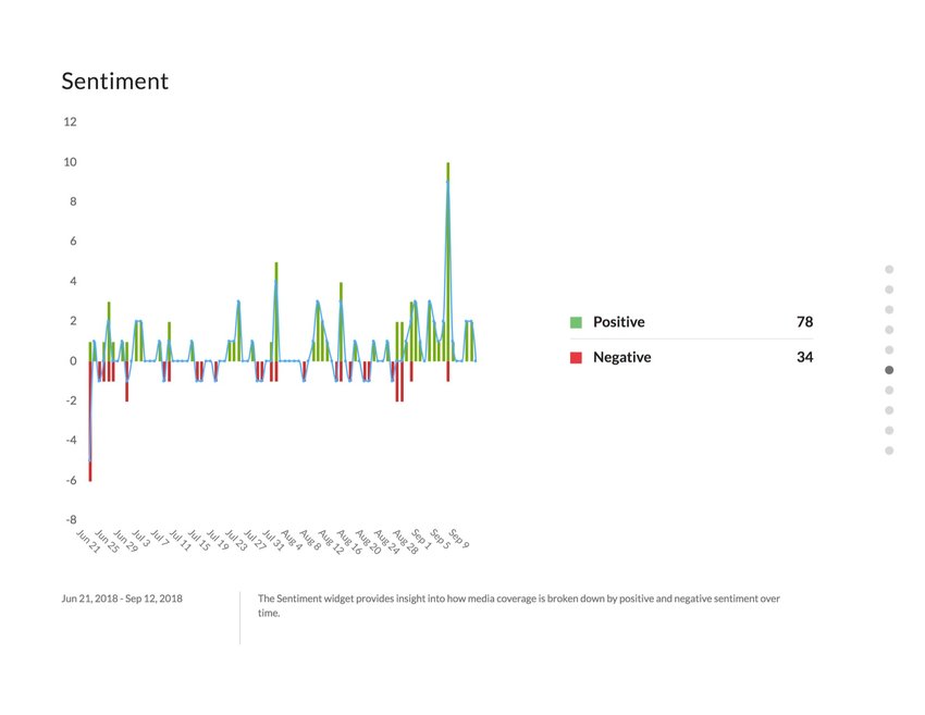
Sentiment - This provides a look at each document and boils the article,s tone into either positive, negative or neutral. It helps give context to the article and, holistically, provides an overview as to the tone of your search, your brand, or relevant topics to you.
Pro Tip We support nearly 20 languages that we can determine a sentiment for.
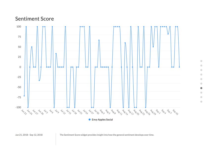
Sentiment Score - A way to boil your sentiment down to a single number. It sums the percent of positive articles against the negative articles, ignoring “neutral˝ articles.
Pro Tip For example, if half of your articles are positive, and the other half are negative, expect a score of ‹0›. Whereas if all are positive, expect a score of ‹+100›.
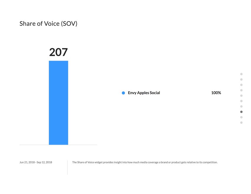
Share of Voice - For all intents and purposes, it,s the same widget as Media Exposure, but used primarily for multiple inputs. It should be used to compare you vs. yourself (for instance, country vs. country breakdowns) or you vs. your competitors (Tesla vs. Mercedes vs. Audi).
Social Reach - The Social Reach widget shows the reach of Twitter, Facebook, Instagram and YouTube posts in a stacked bar chart. To see how this data is gathered, you can read this article.
Pro Tip The y-axis of the bar chart is on a logarithmic scale, meaning that the size of the segments is not proportional to their reach size. Look at the order of the stack to see which sources have the most. You can read more here.
Social Reach vs. Social Volume - Widget gives insight into the relationship between number of potential viewers that have been exposed to a message and the amount of media coverage on a brand, product, event or topic.
Text - To curate or comment on the findings in the data. The best use is highlighting the key takeaways from your dashboard.
Pro Tip If you know some basic HTML, you can
format the text in this widget .
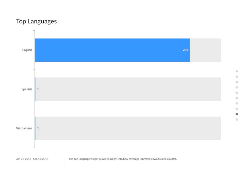
Top Languages - With over 50 languages detected, it,s easy to find what the top languages are discussing your brand. It can be used as a possible alternative to Top Locations and perhaps a different measure to track global mentions as to how your campaign is gaining traction.
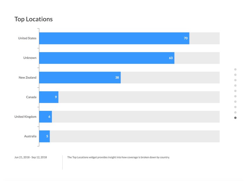
Top Locations - Which countries wrote the most articles about your brand? Some may be straightforward, but some may be surprising. Discover how far-reaching your brand resonates and whether your cross-country campaigns are gaining traction within the top locations that are displayed. Pro Tip If your country doesn’t appear in the top locations, simply use the filtering capabilities to show where your target countries are relative to the top countries.
Top Posters - Determine which of your social influencers are posting the most content about your searches. Useful to determine which social influencers are most impactful to your brand and can potentially be brand ambassadors.
Top Sources - Which sources/channels are writing about your brand or PR or Social Media efforts the most? Use this widget to determine how frequently specific sources reference your company.
Topic Momentum - Similar to the Trending Themes widget, Topic Momentum is used for word or concept analysis. However, it automatically compares the current period of time to the previous. This helps you understand the conversations that are happening over time.
Trending Themes - Allows a user to understand the types of conversations that are happening with their searches. It aggregates all the words that are used in the content within that period of time and surfaces the words that appear most.